 USA AI Tools
How to Make CSS Gradient Buttons That Pass Contrast Checks
 By Naumann Nasir · Last updated
Gradient buttons and banners are everywhere, and for good reason: two colours blending into each other look modern and draw attention. The catch is readability. A gradient changes colour across its width, so white text that is easy to read on one end can almost disappear on the other. That is a design problem and an accessibility problem.
This guide shows a practical way to build a gradient and prove that its text is readable, using four free tools on this site: the CSS Gradient Generator, the Color Contrast Checker, the Color Palette Generator and the HEX to RGB Converter. Every contrast ratio below was measured with the checker.
What "readable" means: WCAG contrast in one paragraph
The Web Content Accessibility Guidelines (WCAG) measure contrast as a ratio between the lighter and darker colour, from 1:1 (identical colours) to 21:1 (black on white). For normal-size text, level AA asks for at least 4.5:1. Large text, meaning at least 24 pixels regular or about 18.7 pixels bold, needs at least 3:1. The stricter level AAA asks for 7:1 for normal text. The Color Contrast Checker shows all three results at once as Pass or Fail.
With a gradient, the rule of thumb is simple: the text must pass against every colour in the gradient, and in practice that means checking both end colours. If both ends pass, the blended colours in between will normally pass too, as long as the gradient runs between two colours of similar lightness.
Step 1: Build the gradient
Open the CSS Gradient Generator, pick two colours, choose linear or radial and set an angle. For this example we used a blue (#2563eb) and a violet (#7c3aed) at 135 degrees, which runs diagonally from the top left to the bottom right.
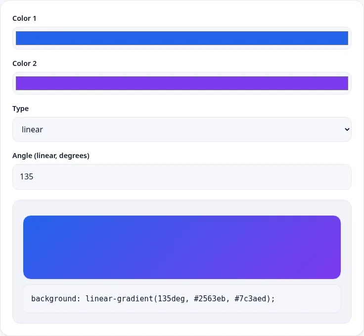
The tool produces one line of CSS:
background: linear-gradient(135deg, #2563eb, #7c3aed);Step 2: Check the text against both ends
Next, enter the text colour and each end colour into the Color Contrast Checker. For white text on our two colours:
| Text | Background | Ratio | AA normal | AA large | AAA normal |
|---|---|---|---|---|---|
| #ffffff | #2563eb (blue) | 5.17 : 1 | Pass | Pass | Fail |
| #ffffff | #7c3aed (violet) | 5.70 : 1 | Pass | Pass | Fail |
Both ends pass AA for normal text, so white button labels on this gradient meet the usual target. Neither reaches AAA, which is fine for most sites but worth knowing if your organisation requires AAA.
Step 3: See what happens with lighter colours
Lighter, pastel gradients are popular, so we tried a light blue (#60a5fa) to light violet (#a78bfa). The gradient generator produced background: linear-gradient(90deg, #60a5fa, #a78bfa);, and it looks soft and friendly. The contrast checker is less impressed:
| Text | Background | Ratio | AA normal | AA large |
|---|---|---|---|---|
| #ffffff | #60a5fa | 2.54 : 1 | Fail | Fail |
| #ffffff | #a78bfa | 2.72 : 1 | Fail | Fail |
| #1e3a8a (dark blue) | #60a5fa | 4.07 : 1 | Fail | Pass |
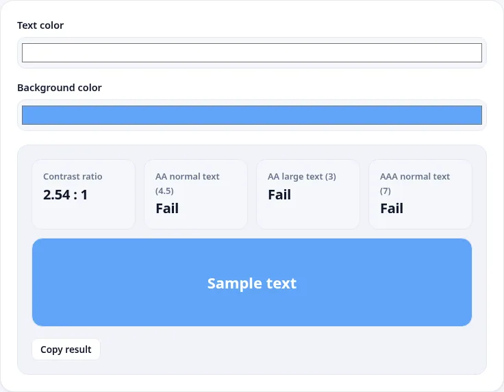
White text fails completely on the pastel gradient, even for large headings. Switching to dark blue text gets closer, but at 4.07:1 it only passes for large text. To use a light gradient, you need either a darker text colour or lighter backgrounds.
Step 4: Fix it with shades from one colour family
The easiest fix is to stay in the same colour family and move lighter or darker. The Color Palette Generator's "Shades and tints" scheme gives seven versions of a base colour. For #2563eb it returned:
#04122F, #0B2C75, #1146BB, #2D69EC, #739BF2, #B9CDF9 and #E8EEFD.
Some combinations from that list, checked with the contrast checker:
- White on
#1146bb: 8.02 : 1, passing AA and AAA. A good choice for a darker, more serious button. - Dark
#0b2c75text on very light#e8eefd: 11.08 : 1, passing everything. Ideal for a light banner with dark text. - Dark
#1e3a8atext on#b9cdf9: 6.49 : 1, passing AA for normal text.
So a light gradient from #e8eefd to #b9cdf9 with dark blue text, or a dark gradient from #1146bb to #2563eb with white text, would both be readable. Check both ends of whichever you choose.
A note on our own brand colours
Out of interest, we also checked this site's own default gradient colours, and the result was humbling. White text on our indigo, #6366f1, measured 4.47 : 1, just short of the 4.5:1 AA target for normal text. White on the pink end, #ec4899, measured 3.53 : 1, which passes for large text only. Both are fine for big, bold headings, but they are borderline for small white labels. It is a useful reminder that bright accent colours, pink and orange in particular, often look strong while still falling short on contrast.
Step 5: Turn the colours into CSS you can maintain
If you work in a design system, you may need RGB or HSL values as well as HEX. The HEX to RGB Converter turned #2563eb into rgb(37, 99, 235) and hsl(221, 83%, 53%). HSL is handy for gradients because you can keep the hue and saturation and change only the lightness to create related shades.
A small, readable gradient button might look like this:
.btn-gradient {
  background-color: #2563eb; /* solid fallback */
  background-image: linear-gradient(135deg, #2563eb, #7c3aed);
  color: #ffffff;
  font-weight: 600;
  padding: 12px 20px;
  border-radius: 10px;
}
The solid background-color matters. If the gradient fails to load or a user's high-contrast mode removes background images, the text still sits on a colour that passes contrast.
Radial gradients and dark mode
The same checks apply to radial gradients, where colour changes from the centre outwards. The generator's radial option produces CSS such as radial-gradient(circle, #0ea5e9, #10b981). Text placed in the centre sits on the first colour, but longer labels can stretch towards the edge colour, so check both again.
If your site has a dark mode, test the dark-mode version separately. A gradient that works with white text on a light page may sit next to a near-black background in dark mode, which changes how the button stands out from the page even if the label itself still passes. WCAG also asks for at least 3:1 contrast between important interface elements, such as a button's edge, and the background around them. Run that check with the button's end colours against your dark page background.
Common mistakes with gradient text
- Checking only the middle of the gradient. The weakest point is usually one of the ends. Check both.
- Judging by eye on a bright screen. Text that looks fine on a high-end laptop can be hard to read on a phone in sunlight. Trust the ratio.
- Placing text over a gradient plus an image. The contrast checker works with solid colours. If you overlay text on a photo, add a dark or light overlay layer first and check text against that colour.
- Forgetting focus and hover states. If the button gets lighter on hover, check the hover colours too.
- Relying on colour alone. Contrast is one part of accessibility. Button labels should also be clear words, and links should be identifiable without colour, for example with an underline.
Quick checklist
- Create the gradient in the CSS Gradient Generator and copy the CSS.
- Check your text colour against both end colours in the Color Contrast Checker.
- Aim for at least 4.5:1 for normal text and 3:1 for large text.
- If it fails, pick darker or lighter shades from the Color Palette Generator and check again.
- Add a solid fallback background colour that also passes.
Gradients and accessibility are not opposites. With two quick checks per gradient, you can keep the look you want and make sure everyone can read what the button says.
More free images & design tools
Image Compressor
Shrink JPG, PNG and WebP files in your browser. Nothing is uploaded.
🎨Image Resizer
Resize images to exact pixels or by percentage.
🎨Image Format Converter
Convert images between JPG, PNG and WebP.